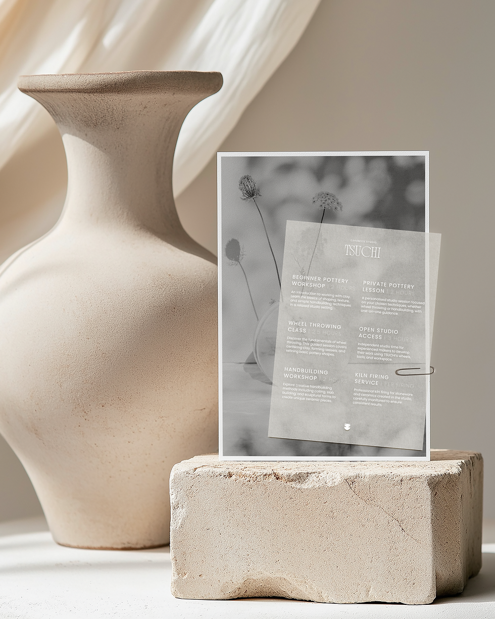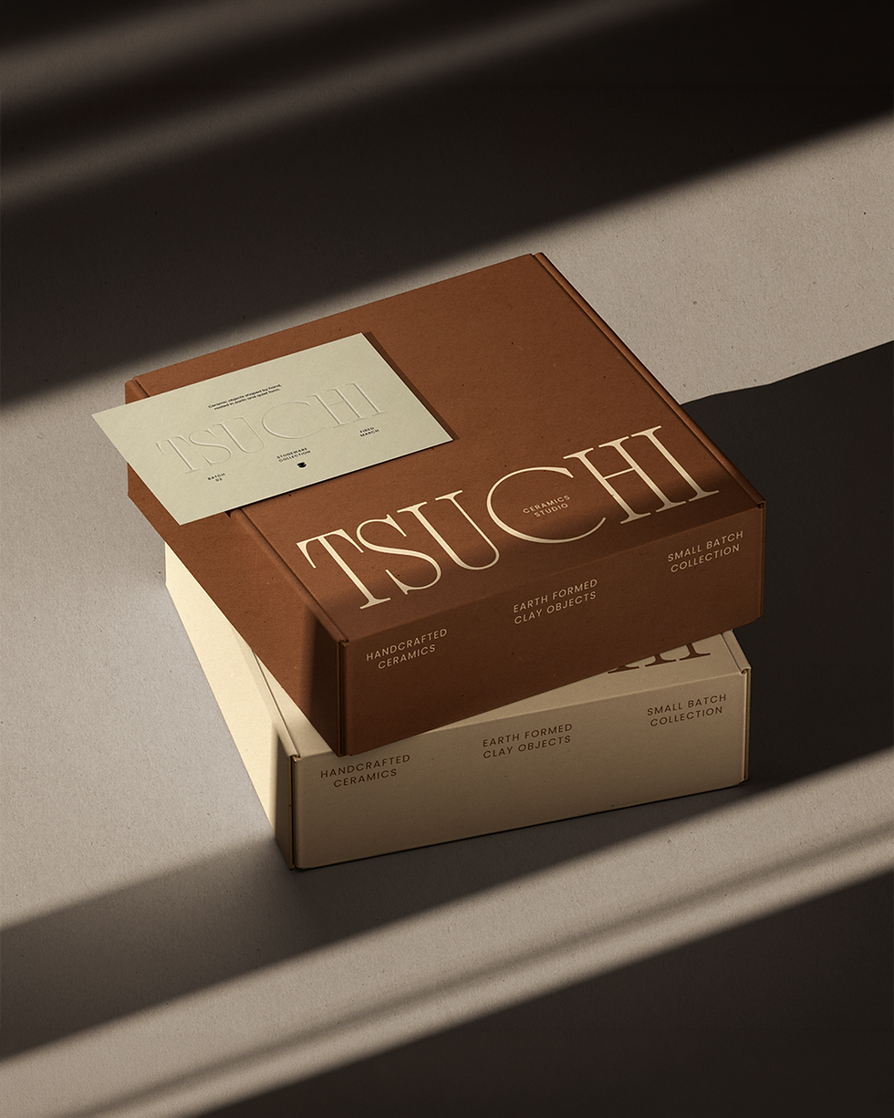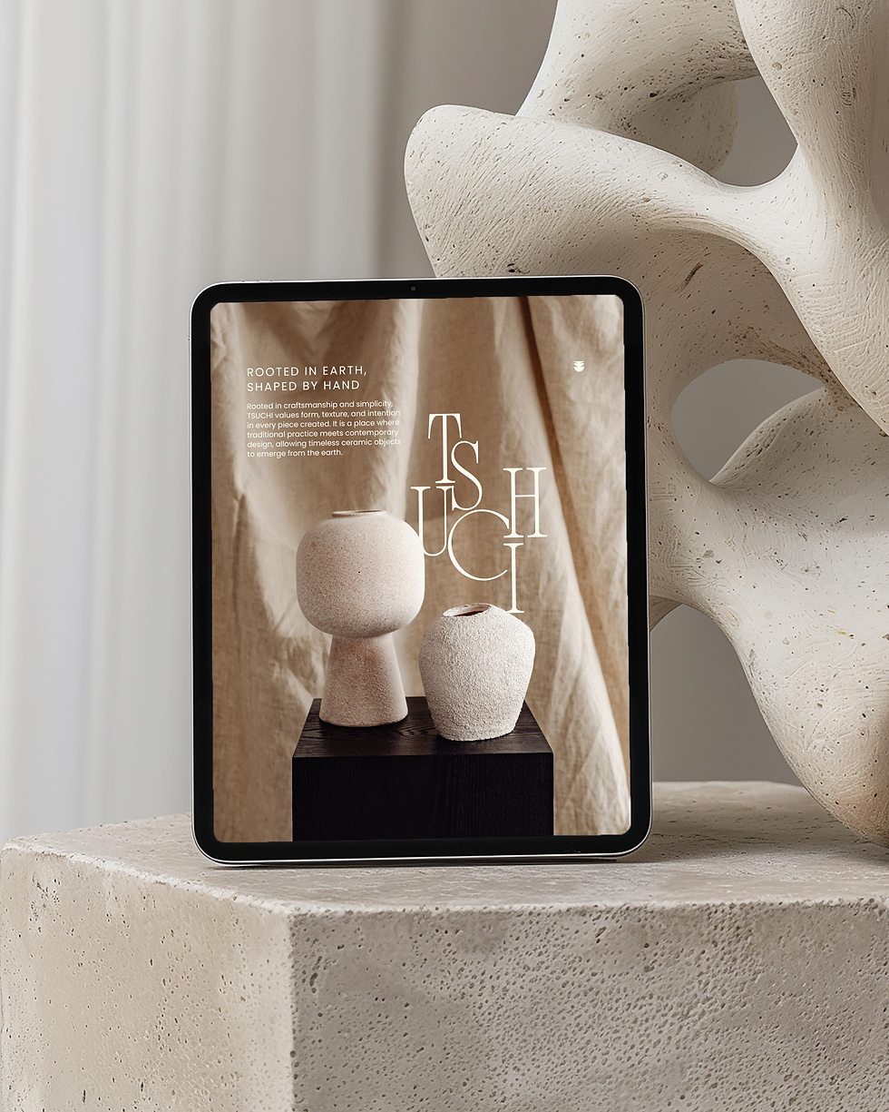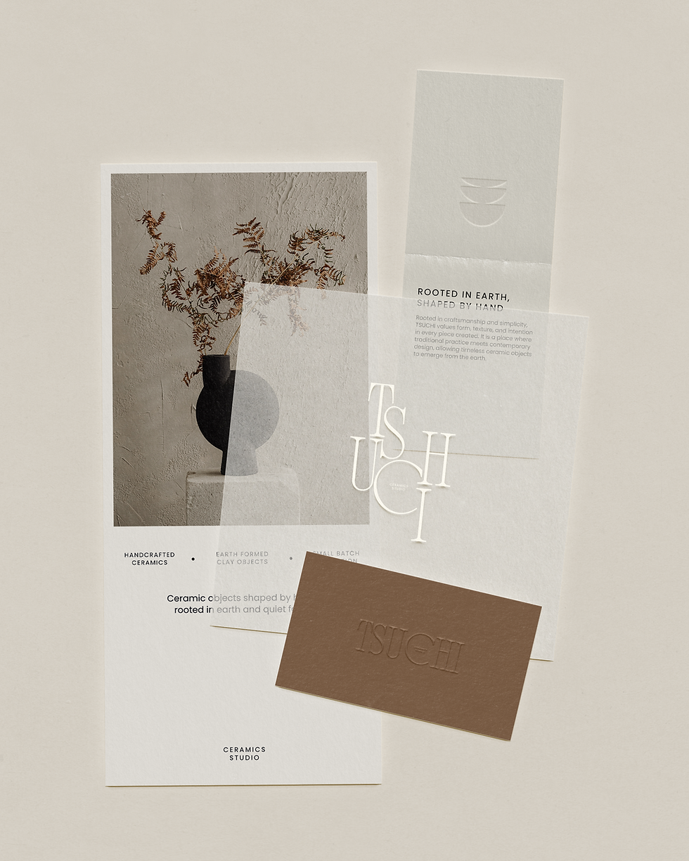

The visual language is intentionally restrained, allowing texture, surface and form to carry much of the brand expression. Earth tones, warm cream, clay brown and soft grey create a palette that feels natural and elevated, supported by editorial imagery of ceramic forms, raw surfaces and quiet studio details. Across the shopfront, large-scale window poster, website, tablet layouts, mailer boxes and printed workshop materials, the identity remains calm, tactile and cohesive.
Materiality plays an important role throughout the project. Embossed finishes, layered paper pieces and muted packaging applications mirror the physical quality of clay, reinforcing the idea that the brand is shaped through touch as much as through visual design. The mailer boxes extend the studio’s small-batch positioning into a more polished product experience, while the workshop materials help make the brand feel accessible to both collectors and makers.
For Tsuchi, the finished identity creates a brand experience that feels closely connected to the hand, the material and the making process. Each application reinforces the studio’s balance of craft and restraint, giving its objects, workshops and printed touchpoints a quiet sense of permanence and care.
Tsuchi Ceramics Studio is a design-led ceramics brand rooted in material honesty and slow making. The brief was to create a brand identity for a contemporary ceramic studio that could support both product-led collections and hands-on studio experiences, from small-batch clay objects to workshops, private pottery lessons and open studio access. Inspired by 土, read as tsuchi in Japanese and meaning earth, the identity needed to feel grounded, tactile and refined, while communicating the care, discipline and quiet precision behind objects shaped by hand.
Our aim was to develop a visual system that felt closely connected to the material process itself. Rather than positioning Tsuchi as overly rustic or craft-led in a conventional way, the brand needed to balance the warmth of handmade ceramics with the restraint of a design-led studio. The line “Rooted in Earth, Shaped by Hand” became a central expression of this approach, connecting the origins of the material with the human process behind each piece.
The wordmark uses elegant, high-contrast letterforms arranged with a sculptural quality, giving the identity a sense of height, rhythm and form. Its vertical composition creates a distinctive presence across window graphics, digital layouts and printed pieces, while maintaining clarity at scale. A small symbol introduces a softer mark that can be used with subtlety across the wider brand system.
Brand Identity, Print Design
Tsuchi Ceramics Studio
Rooted in Earth, Shaped by Hand