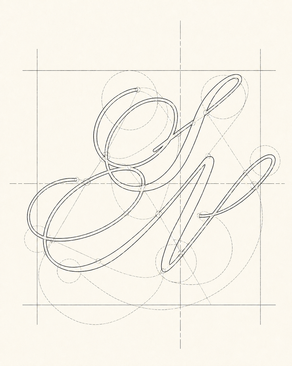

Its drawn quality references the curves, transitions and controlled lines found within Pilates itself.
The wider visual system uses warm neutrals, soft pale pink and gentle brown accents to create a calm, tactile environment. Layered paper textures, translucent overlays and softly cropped movement imagery give the identity depth without making it feel busy. Across the studio window, printed materials, Pilates ball, mobile experience and poster application, the brand remains minimal, refined and highly recognisable.
Digital design plays an important role in making the brand feel personal and accessible. The mobile screens introduce a softer onboarding experience, guiding new clients through questions around practice frequency, Pilates level and core focus. This creates a digital touchpoint that feels considered and supportive, helping the studio meet clients where they are while maintaining the same calm visual language.
For Second Nature, the brand system brings together precision, softness and ease in a way that mirrors the practice itself. Across the studio, digital experience and printed applications, the identity supports a calm and elevated wellness space where movement feels considered, personal and naturally integrated.
Second Nature Pilates positions movement as something instinctive, considered and deeply integrated into daily life. The identity needed to position the studio as a calm and elevated destination for Pilates, while communicating both the technical precision of the practice and the softer sense of flow that comes through breath, alignment and repetition. Rather than creating a fitness brand led by intensity or transformation language, the direction focused on a quieter form of strength, one that feels intentional, graceful and sustainable.
Our objective was to create a brand system that could balance structure with softness. Second Nature needed to feel professional and grounded enough to communicate expertise, but also warm and intuitive enough to reflect the experience of moving through the body with awareness. The slogan “Where Form Meets Flow” became the foundation for this positioning, bringing together the two sides of the studio: the discipline of correct movement and the ease that comes when the practice begins to feel natural.
The logo system reflects this duality through a contrast of typographic styles. The word “second” is set with a clean, confident weight, while “nature” introduces a softer italic rhythm, creating a mark that feels both stable and fluid. A flowing monogram extends this language further, bringing a sense of continuous movement across window graphics, stationery, digital screens and atmospheric brand details.
Brand Identity, Social Media Design
Second Nature Pilates
Where Form Meets Flow