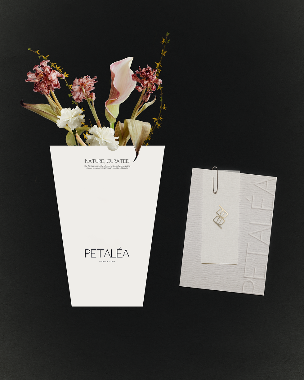

The colour palette is soft and restrained, led by warm neutrals, muted blush tones and fresh white space. These tones allow the florals to carry the emotional colour of the brand, while keeping the wider identity calm and elevated. Across the shopfront, website, stationery, floral carrier bag, branded tape, tags and wrapping paper, the system remains consistent and tactile, with embossed finishes and layered paper details reinforcing the atelier positioning.
Photography plays an important role in shaping the brand world. Close-up floral imagery, soft skin tones and monochrome botanical details give the identity an editorial quality, creating a visual language that feels intimate without losing sophistication. The website extends this direction digitally, using clean navigation, generous image-led layouts and concise copy to communicate the brand’s curated approach with clarity.
Peteléa’s identity creates a refined framework for a brand where nature is edited with care. The system allows the flowers to remain the emotional focus, while the typography, packaging, digital presence and printed details bring structure, softness and recognition to the atelier experience.
Peteléa Floral Atelier reframes flowers as curated compositions, shaped with restraint, seasonality and care. The project required a brand identity that could position Peteléa as refined, artisanal and design-led, while still allowing the natural beauty of the flowers to remain the focus. With the slogan “Nature, Curated” at the centre of the brand, the identity needed to feel delicate, tactile and quietly luxurious, reflecting the care behind each bouquet, installation and everyday floral gesture.
Our objective was to create a visual system that felt editorial and refined without becoming overly decorative. Peteléa needed to speak to customers who value flowers not only as gifts, but as part of an elevated lifestyle, something seasonal, sensory and intentionally chosen. The brand therefore balances softness with restraint, using minimal layouts, subtle detail and generous space to create a calm framework around the movement and colour of the florals themselves.
The wordmark is elegant and understated, giving the brand a clean, confident presence across both digital and physical applications. Paired with a refined monogram, the identity introduces a more ornamental secondary mark that can appear with subtlety across tags, stationery and wrapping details. This creates a flexible system where the main logo feels minimal and modern, while the supporting mark brings a sense of craft, intimacy and recognition.
Brand Identity, Print Design
Peteléa Floral Atelier
Nature, Curated