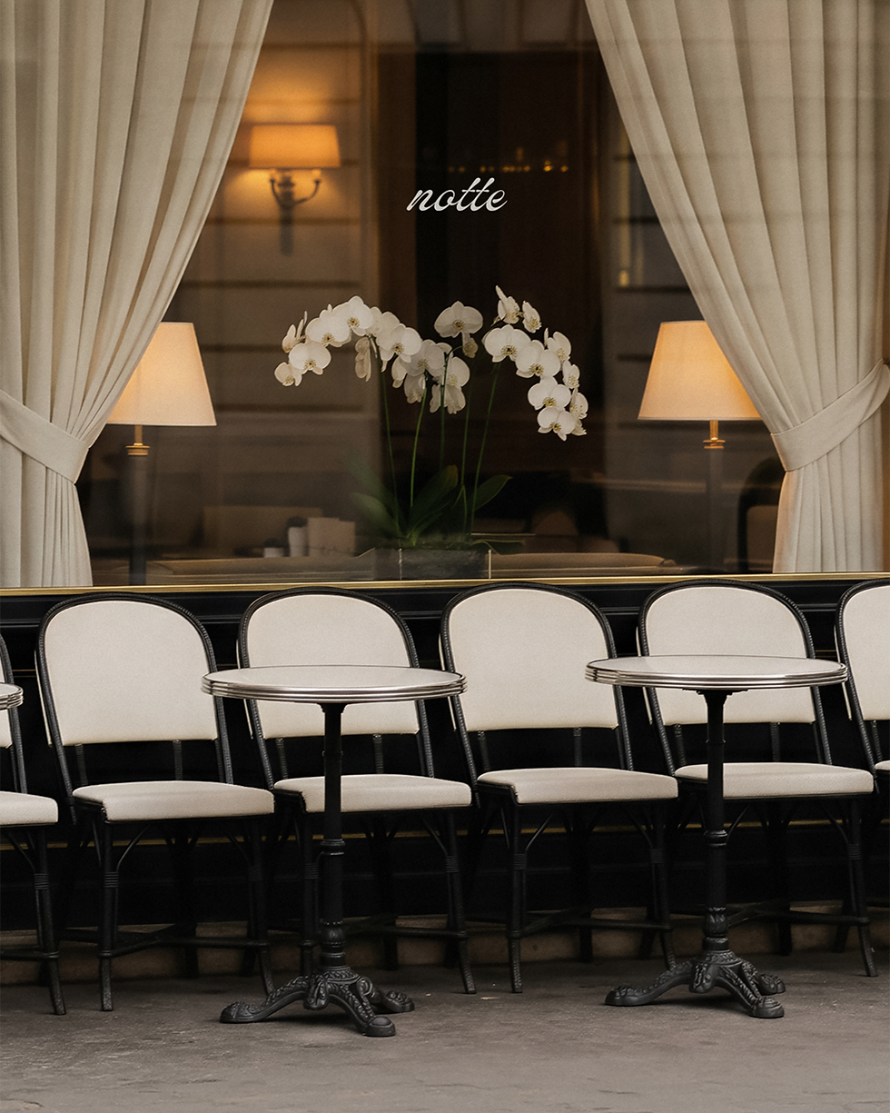
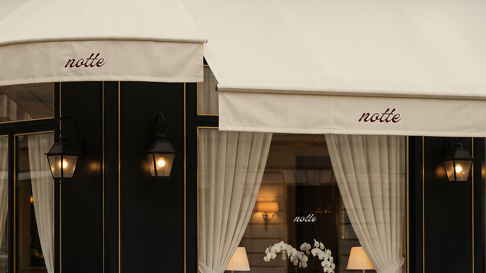
Rather than introducing additional symbols or decorative motifs, the identity relies on repetition, material contrast and confident spacing to build recognition.
Menu design played an important role in shaping the restaurant’s positioning. The menu is organised by element: Sea, Land, Earth and Ember, with each dish described through key ingredients rather than lengthy explanation. This gives the dining experience a refined, ingredient-led rhythm and supports the restaurant’s seasonal Mediterranean approach. The tasting menu is treated with the same restraint, listed simply by course number and price, allowing the experience to reveal itself at the table.
Across the printed, digital and editorial applications, the identity remains warm, minimal and highly controlled. Textured menu paper, translucent dark cherry overlays, refined stationery, digital booking details and the Notte Kitchen cookbook extend the atmosphere beyond the dining room. The finished brand gives Notte a hospitality identity that feels atmospheric without relying on excess. From the menu language to the digital booking details and editorial applications, each touchpoint extends the feeling of the evening, positioning the restaurant as intimate, seasonal and quietly memorable.
At Notte Restaurant, the evening becomes part of the dining experience. The project called for a visual identity that could translate this atmosphere into a refined hospitality brand, one that felt European in spirit, quietly confident and deeply atmospheric, while avoiding the visual clichés often associated with fine dining. With its name taken from the Italian word for night, Notte needed to feel restrained, memorable and complete through very few elements: a distinctive wordmark, a confident palette, considered menu language and a digital presence that reflected the same sense of anticipation.
The visual direction is led by contrast. A dark cherry palette is paired with cream, warm neutrals and softly lit photography, creating a brand world that feels nocturnal without becoming heavy. The restaurant façade uses cream awnings, black framing, draped curtains and a minimal script mark to create a quietly cinematic first impression. Inside the system, the slogan “Where night lingers” gives the identity its tone, acting as a subtle narrative line rather than a conventional restaurant tagline.
The Notte wordmark is intentionally expressive, bringing softness and movement to an otherwise minimal identity. Its handwritten quality gives the brand a sense of intimacy, while its simplicity allows it to work across signage, menus, editorial layouts, digital touchpoints and smaller printed details.
Brand Identity, Print Design
Notte Restaurant
Where Night Lingers