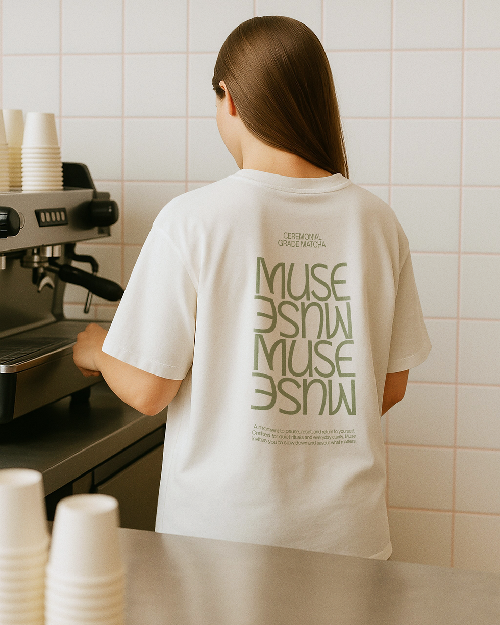

A secondary typographic arrangement adds flexibility, appearing over photography and smaller printed details with a quieter, more editorial feel. The colour palette is led by muted matcha green, soft cream and warm neutral tones, creating a visual world that feels natural, tactile and contemporary. Packaging plays an important role in establishing the brand’s premium positioning. The product box uses large-scale typography, subtle copy and a textured green finish to create a sense of calm quality, while the takeaway cups and carry packaging translate the identity into everyday rituals with clarity and consistency.
Digital and lifestyle applications extend the brand beyond the product itself. The website brings together pop-up information, recipes and at-home matcha rituals through a clean, image-led layout, positioning Muse as both a product and a lifestyle experience. The pop-up cart adds a more social and accessible touchpoint, allowing the brand to move naturally between retail, hospitality and daily routine. Editorial imagery of whisking, pouring and soft matcha textures reinforces the sensory quality of the ritual without over-explaining it.
Muse now has a brand identity that makes matcha feel both elevated and part of everyday life. Through calm packaging, soft repetition, lifestyle-led digital touchpoints and a clear sense of origin, the system turns a daily drink into a refined ritual of focus and pause.
Muse Matcha reframes a daily drink as a small ritual of focus, pause and inspiration. The identity needed to elevate ceremonial grade matcha into a modern lifestyle experience, one that felt calm, refined and culturally aware, while still remaining approachable for everyday use. With the line “Your Daily Muse” at the centre of the brand, Muse was positioned as a quiet moment of pause, focus and inspiration within the rhythm of daily life.
Our objective was to create a brand system that could balance heritage with contemporary ease. Matcha carries a long-standing ritual and material richness, but Muse needed to communicate this in a way that felt fresh, minimal and relevant to a modern audience. The direction therefore focused on restraint, softness and rhythm, allowing the brand to feel intentional without becoming overly formal. The identity is grounded in ceremonial grade matcha sourced from Kyoto, Japan, giving the brand a clear sense of origin, while the wider visual language keeps the experience clean, current and lifestyle-led.
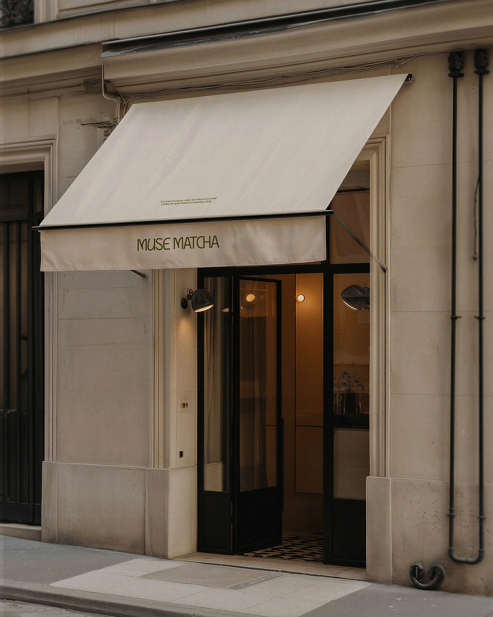
The wordmark is distinctive and softly expressive, with rounded letterforms that feel relaxed, memorable and highly ownable. Its stacked composition creates a strong graphic presence across the shopfront, product box, staff apparel, takeaway cups and pop-up cart, while repeated logo treatments introduce rhythm and recognition across the wider system.
Brand Identity, Social Media Design
Muse Matcha
Your Daily Muse