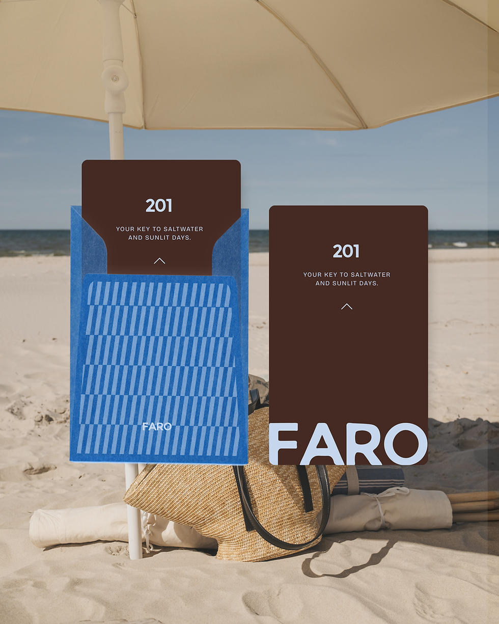

A repeated blue and brown pattern introduces a more recognisable graphic language, appearing across the billboard, tote bag, retreat guide and key card sleeve. This pattern brings energy and recall to the system, balancing the quietness of the retreat concept with a visual device that feels designed, ownable and immediately recognisable.
The guest journey is supported across both physical and digital touchpoints. The key cards use short, sensory copy to create a moment of arrival, while the mobile screen and website extend the retreat experience into a calm digital environment. Navigation, booking details and editorial sections are handled with restraint, allowing the brand to feel clear and premium rather than overly descriptive.
Photography plays a central role in defining Faro’s atmosphere. Coastal scenes, soft interiors, skin, sea air, shells and sunlit details create a visual rhythm that feels immersive and unhurried. The collage application adds an editorial layer to the identity, while the retreat guide gives the brand a more collectible, destination-led quality. Faro’s identity now carries the feeling of the retreat before arrival, creating a brand experience shaped by pace, texture and place. Across digital, print and guest touchpoints, the system invites people into a slower rhythm, positioning Faro as a destination for restoration, presence and quiet luxury.
Faro Retreats invites guests into a slower way of experiencing luxury, where restoration, space and presence lead the brand. The project called for a brand identity that could position Faro at the intersection of restoration, escape and quiet indulgence, while giving the retreat a distinctive visual presence within the luxury wellness space. With the line “At another pace. The world can wait.” at the centre of the identity, the brand needed to feel calm, confident and transportive, creating a sense of permission before a guest even arrives.
Our objective was to create a visual system that felt both restorative and memorable. Faro needed to communicate stillness and ease, but also retain the polish expected from a luxury retreat experience. The visual direction was therefore built around contrast: warm coastal textures, deep brown tones, soft sky blue, sunlit neutrals and graphic pattern work. This allowed the brand to feel grounded in place while maintaining a more distinctive and contemporary hospitality presence.
The logo is direct and minimal, giving Faro a clear, confident centre point across every application. Its bold uppercase form brings structure to the softer coastal imagery, while the small retreat descriptor keeps the identity focused and refined. Paired with sand textures, seashell forms and slow, atmospheric photography, the mark creates a brand world that feels sensory without becoming overly decorative.
Brand Identity, Print Design
Faro Retreats
At Another Pace, the World Can Wait